Retiro


 1
1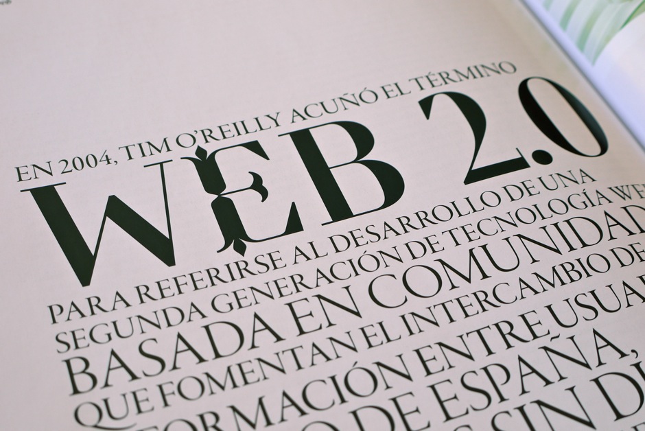 2
2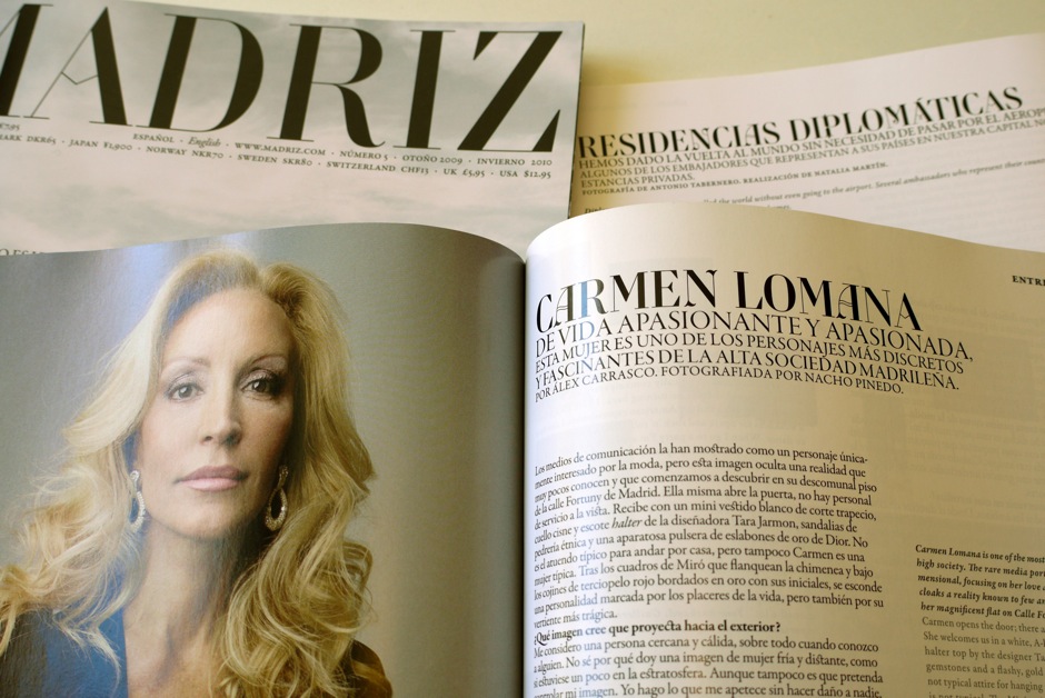 3
3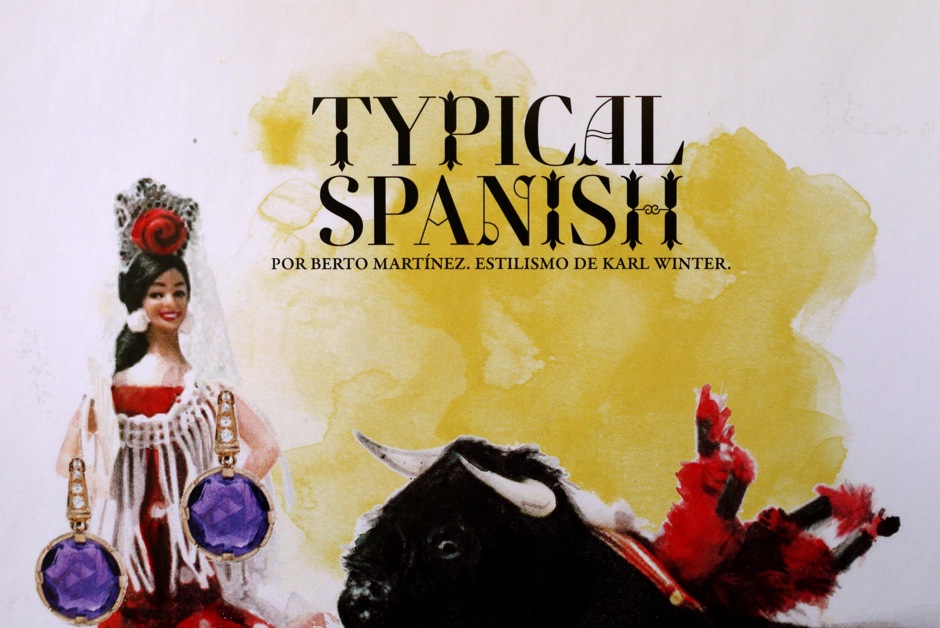 4
4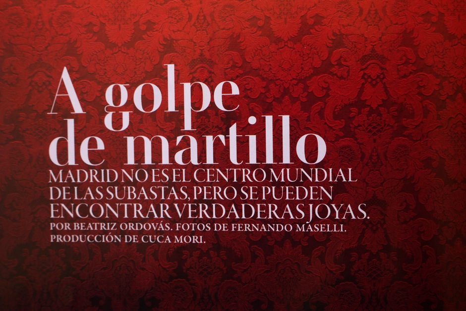 5
5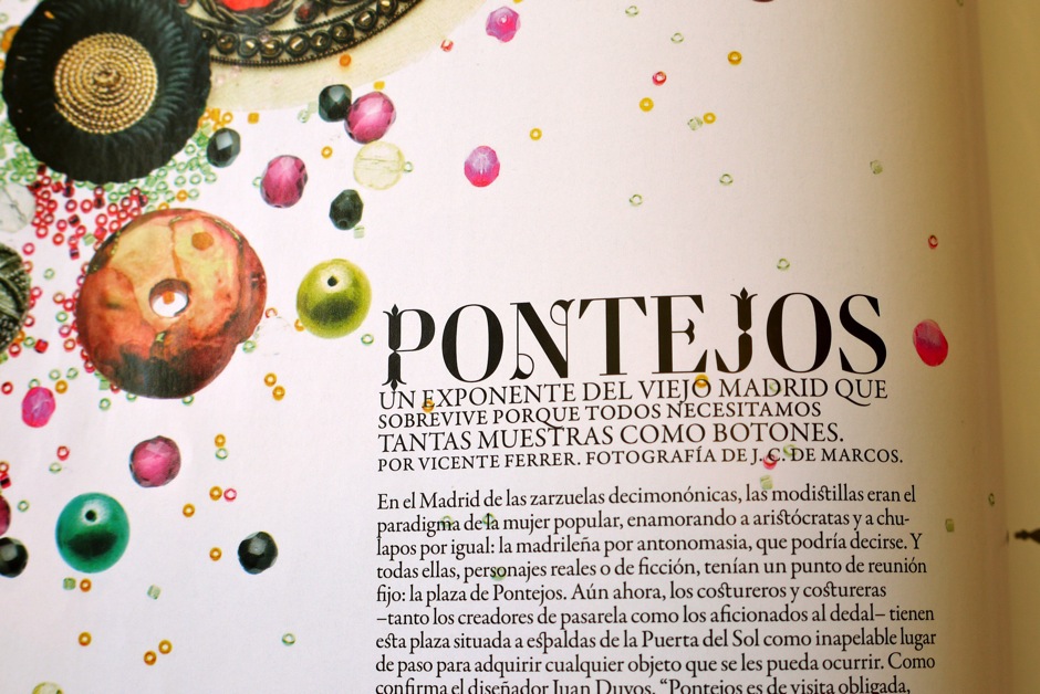 6
6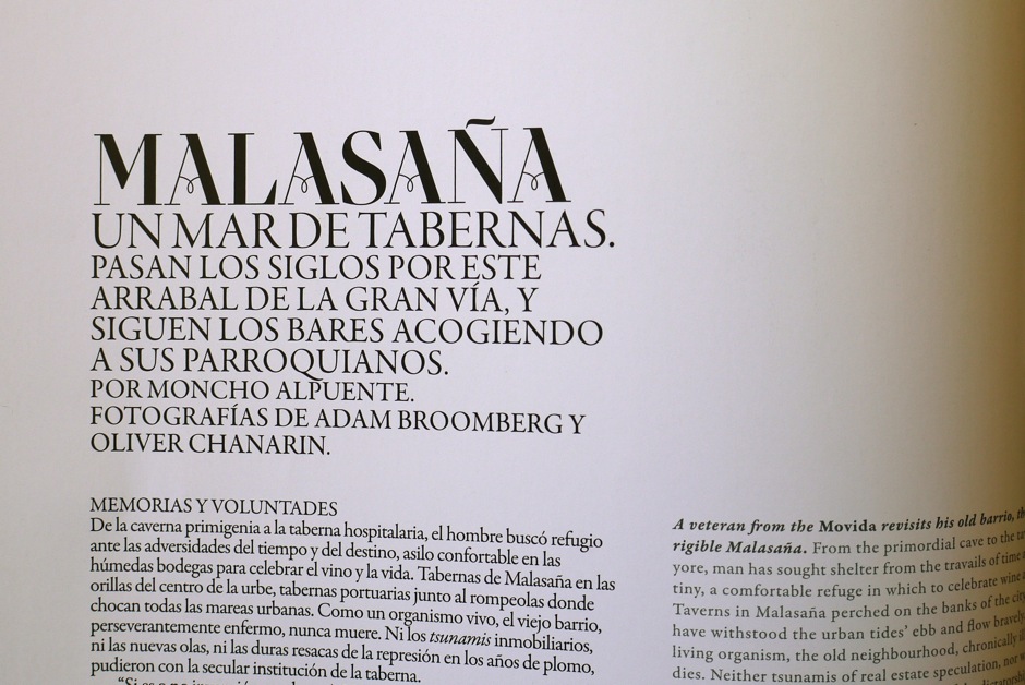 7
7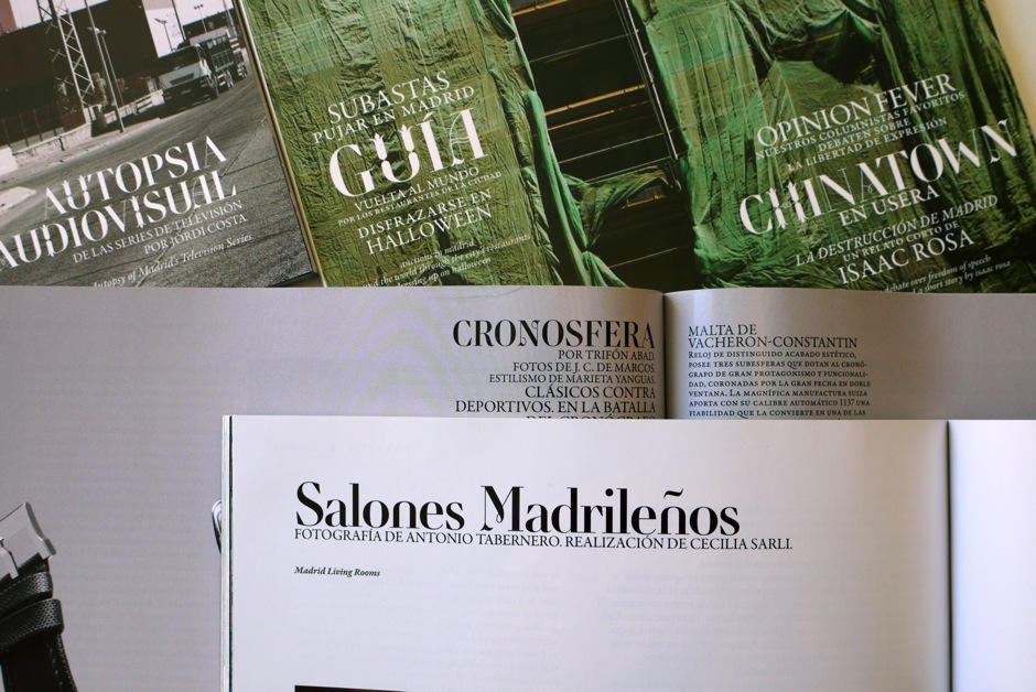 8
8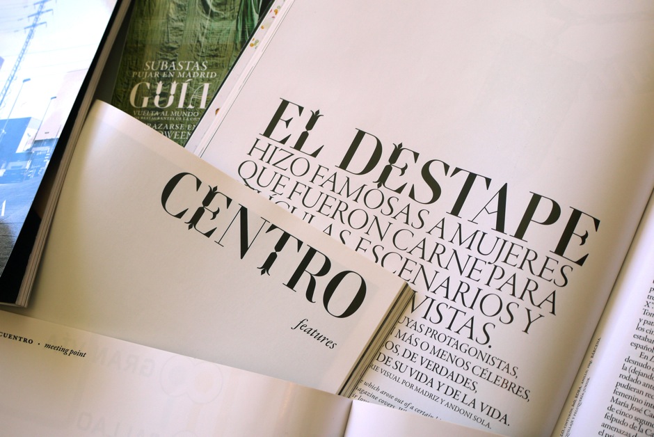 9
9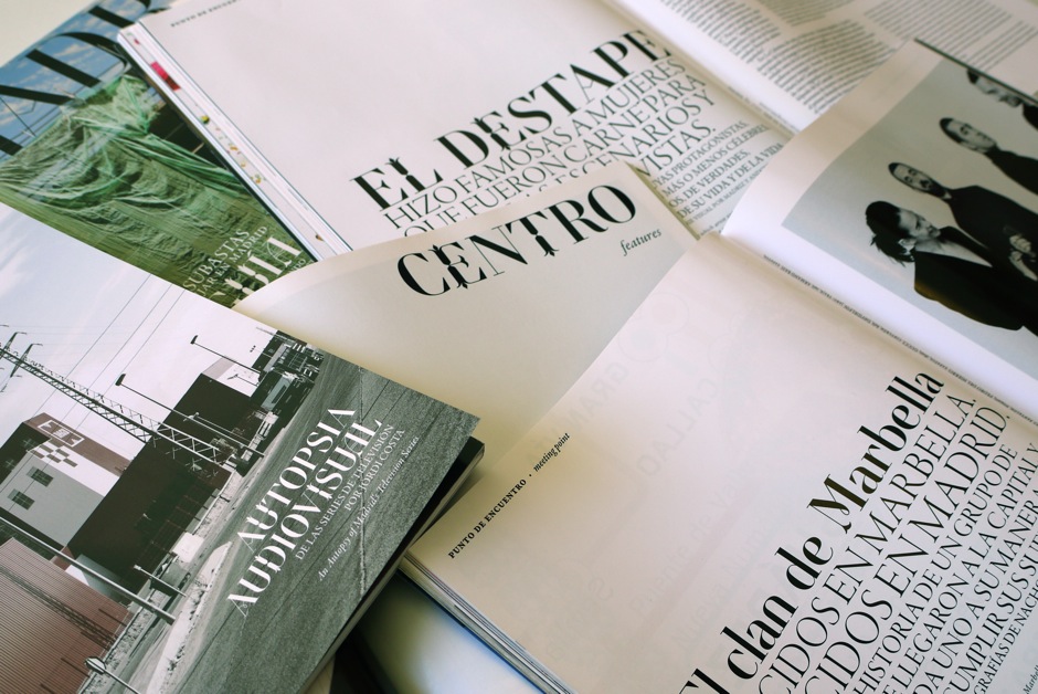 10
10Retiro
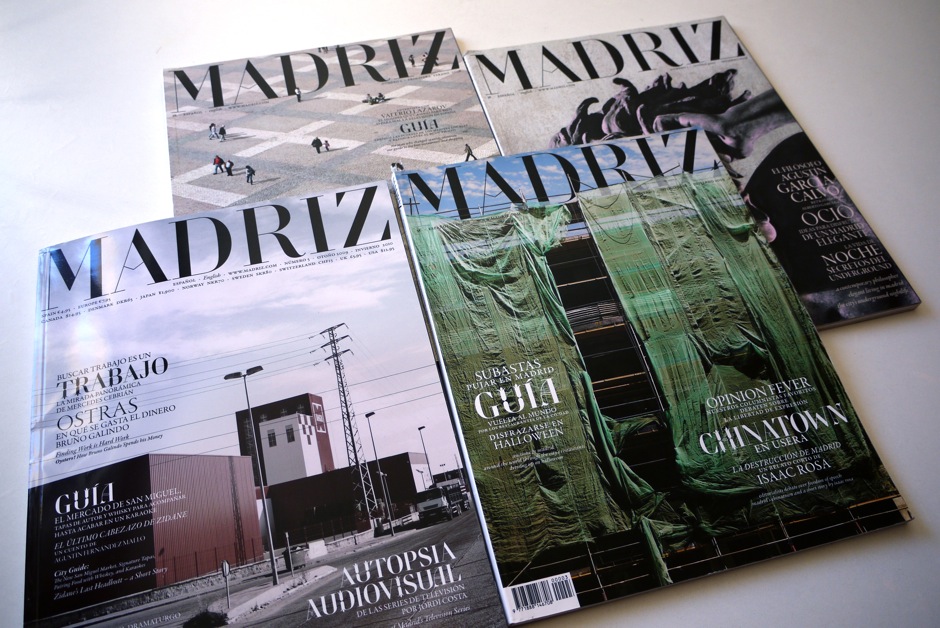
Retiro bespoke typeface was specially designed to gives a unique voice of the Madriz magazine. Madriz, a biannual, bilingual city magazine is a witness to the contrasts between the city’s modernization and its traditions. A guide to Madrid life and culture for residents and tourists alike. The stereotypical “Didot“ masterhead of women’s magazines: Tatler, L’Officiel, Vogue, Harper’s Bazaar was the starting point. Named after a lovely park in Madrid, Retiro is a daring interpretation of Spanish typography. Severe, austere, and yet, full of life. Retiro is a Castilian and Andalusian vernacular version of an usual Didot. Many alternates and ligatures has been added to the family to achieve the highest level of excellent in term of editorial settings.
Retiro is available in a unique weight. 470 glyphs including latin occidental support, 2 sets of figures, various set of capitals superiors, ligatures, alternates, contextual alternates. OpenType features and extended kerning are included. Specific OpenType features are: Contextual alternates; Stylist set 1: Swashes; Stylistic set 2: Alternates 2; Stylistic set 3: Alternates 3; Stylistic set 4: Alternates for masthead A, Z; Stylistic set 5: Alternates 3.
Client: Madriz Magazine.
1. to 10. Retiro typeface in use on Madriz Magazine.
Awards
— Granshan 2012, 5th International Non Latin Type Design Competition, Display category award. Custom typeface Retiro for Madriz magazine, 06-2012.
— Letter.2 prize 2011, among the 53 entries out of 561 submissions based on their design excellence, 11-2011.
— Creative Review Type Annual Custom typeface Retiro for Madriz magazine: Best in Book 2011, 02-2011.
— Designpreis 2011 Nominee Design Award of the Federal Republic of Germany 2011: Custom typeface Retiro Nominee for 2011, 05-2010.
— Club des directeurs artistiques: 41e Palmarés Prix 2009 03-2010.
— Tdc2 2010 Certificate of Type design Excellence for the custom typeface Retiro, 3-2010.
Copyright
Since November 2014, you can download Retiro from Typofonderie